All New!! All Different!!
Welcome back to the brand new Not-So-Daily Dog. Sorry for the long layoff. Around the beginning of April, I suddenly found with the urge – no, more of a compulsion – to do my taxes. That done, I had to dig myself out from under my actual paying work before I could get back to this book.
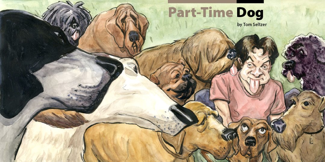
The break gave me a chance to re-work the book a bit. The most radical alteration was that I changed the book into a square format. This required reworking a couple of pages, most importantly the cover (see above. Ain't it pretty?) I'll be unveilng the new look over the next couple of updates.
I've also changed this little email blast. No more hopping to the blog to see the complete post, and I'll be featuring all the text in legibly sized type right below the picture. I know, I know, will the innovation never stop?
More soon, I promise. In the meantime, please, please send me emails or make some comments on the blog.
posted by Tom Seltzer at
1:12 PM
![]()
![]()

2 Comments:
Hi Tom-
I couldn't seem to post comments on the other entries, so I'll leave my initial set of comments here. First off, Great Concept! Was I, your former roommate, philosophy major, and au-pair the inspiration for this gag? If so, I am flattered. If not, I think it's time for both of us to admit that I have lodged in your subconscious and I'm not leaving. In the interest of fully rounding out the character, you might want to give the guy a poker addiction.
I started designing characters a couple of years ago with the intention of puting them on t-shirts and such and kept coming around to the conclusion of: if it's about a child or an animal, make it cute. Cute sells, especially if the subject is repulsive. Since children are, in fact, repulsive, there should be no moral dilemma in doing exactly as nature does. Make them cute so that we can't kill them when they destroy our pricey electronic gadgets. By the way, have I mentioned that I am an uncle?
Anyhoo, this comment refers to the page entitled 'meet the new boss.' Specifically, I would make the child's forehead less angular and his eyes bigger and more innocent, thus disguising the evil intentions that lurk behind them.
My other comment on this piece is that the father's pose is not strong enough and his arms crossed gesture is a little weak If you're going to use crossed arms, I would put a hand resting on the upper arm. In terms of the father's expression, I would make it and his body pose perhaps hopeful that this idea is actually going to work with the kid. Or maybe the guy and the kid are alone in a room and the father is peeking around the corner, hoping not to influence the result. Just a thought. You can ignore these if you like.
By the way, if you were looking for coments on the order of 'This is really great, but could you include a Vizsla in the mix?' or 'I love the color of your web pages, it's sooo soothing!', well, sorry to disappoint.
Best,
Mr. Wilson
May 12, 2009 2:49 AM
Hey Steve --
Nope, I love all the comments, even the critical ones. Mostly. But I think you're projecting into the characters (eg, the kid is a secret monster, the dad should be projecting anxiety about the prospects). Read on....
-Tom
May 12, 2009 12:19 PM
Post a Comment
<< Home